

Is Prince singing 1999 again?
August 21, 2020 | FIRESIDE CHARTS
Some interesting charts today… Have a great weekend!
1. Does anyone else feel that this market looks and feels a lot like 1999?

Source: The Daily Shot, from 8/21/20
2. The main difference has been the speed…the faster pace down and the fastest recovery…ever….

Source: The Daily Shot, from 8/21/20
3. Despite slight moderation last month, the Philly Fed is still showing manufacturing ahead of pre-pandemic activity levels…

Source: The Daily Shot, from 8/21/20
4. As the markets digest recent gains a bit, what does the historic picture look like in election years?
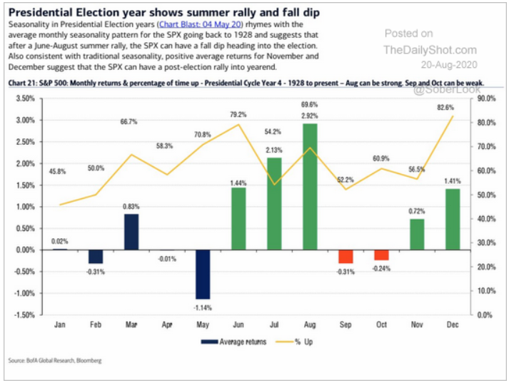
Source: The Daily Shot, from 8/20/20
5…And an even longer viewpoint. In particular, will bond yields come back to the 4-5% historic inflection point?

Source: The Daily Shot, from 8/20/20
6. Understandably, the Covid shutdowns are causing bond downgrades across the credit spectrum. Despite the surge in fallen angels (BBB to junk status), BBB is still growing…
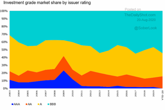
Source: The Daily Shot, from 8/20/20
7. Duration has also been increasing. Extremely low rates, increased credit and duration risk, and investors are still pouring money into bonds. What could possibly go wrong?

Source: The Daily Shot, from 8/20/20
8. If yields follow the ISM (old PMI), then bonds are in for a serious correction. Yet the Fed, with trillions of buying capability, has stated they want rates at these levels through 2022. Who will win?
-1.png?width=683&name=8.21%20If%20yields%20follow%20the%20ISM%20(old%20PMI)-1.png)
Source: The Daily Shot, from 8/20/20
9. Is one round of stimulus all we are going to get?

Source: The Daily Shot, from 8/20/20
10. Apple has gone parabolic. Historically, parabola up, parabola down. We shall see…

Source: The Daily Shot, from 8/20/20
Disclosure:
Copyright © 2024 Beaumont Capital Management LLC. All rights reserved. All materials appearing in this commentary are protected by copyright as a collective work or compilation under U.S. copyright laws and are the property of Beaumont Capital Management. You may not copy, reproduce, publish, use, create derivative works, transmit, sell or in any way exploit any content, in whole or in part, in this commentary without express permission from Beaumont Capital Management.
Certain information contained herein constitutes “forward-looking statements,” which can be identified by the use of forward-looking terminology such as “may,” “will,” “should,” “expect,” “anticipate,” “project,” “estimate,” “intend,” “continue,” or “believe,” or the negatives thereof or other variations thereon or comparable terminology. Due to various risks and uncertainties, actual events, results or actual performance may differ materially from those reflected or contemplated in such forward-looking statements. Nothing contained herein may be relied upon as a guarantee, promise, assurance or a representation as to the future.
This material is provided for informational purposes only and does not in any sense constitute a solicitation or offer for the purchase or sale of a specific security or other investment options, nor does it constitute investment advice for any person. The material may contain forward or backward-looking statements regarding intent, beliefs regarding current or past expectations. The views expressed are also subject to change based on market and other conditions. The information presented in this report is based on data obtained from third party sources. Although it is believed to be accurate, no representation or warranty is made as to its accuracy or completeness.
The charts and infographics contained in this blog are typically based on data obtained from third parties and are believed to be accurate. The commentary included is the opinion of the author and subject to change at any time. Any reference to specific securities or investments are for illustrative purposes only and are not intended as investment advice nor are they a recommendation to take any action. Individual securities mentioned may be held in client accounts. Past performance is no guarantee of future results.
As with all investments, there are associated inherent risks including loss of principal. Stock markets, especially foreign markets, are volatile and can decline significantly in response to adverse issuer, political, regulatory, market, or economic developments. Sector and factor investments concentrate in a particular industry or investment attribute, and the investments’ performance could depend heavily on the performance of that industry or attribute and be more volatile than the performance of less concentrated investment options and the market as a whole. Securities of companies with smaller market capitalizations tend to be more volatile and less liquid than larger company stocks. Foreign markets, particularly emerging markets, can be more volatile than U.S. markets due to increased political, regulatory, social or economic uncertainties. Fixed Income investments have exposure to credit, interest rate, market, and inflation risk. Diversification does not ensure a profit or guarantee against a loss.
The federal funds rate is the interest rate at which banks lend money to each other overnight. A treasury yield is the interest rate the U.S. government pays on its debt, and the annual return that investors can expect from holding a U.S. government security.
Please contact your BCM Regional Consultant for more information or to address any questions that you may have.
Beaumont Capital Management LLC, 125 Newbury St. 4th Floor, Boston, MA 02116 (844-401-7699)